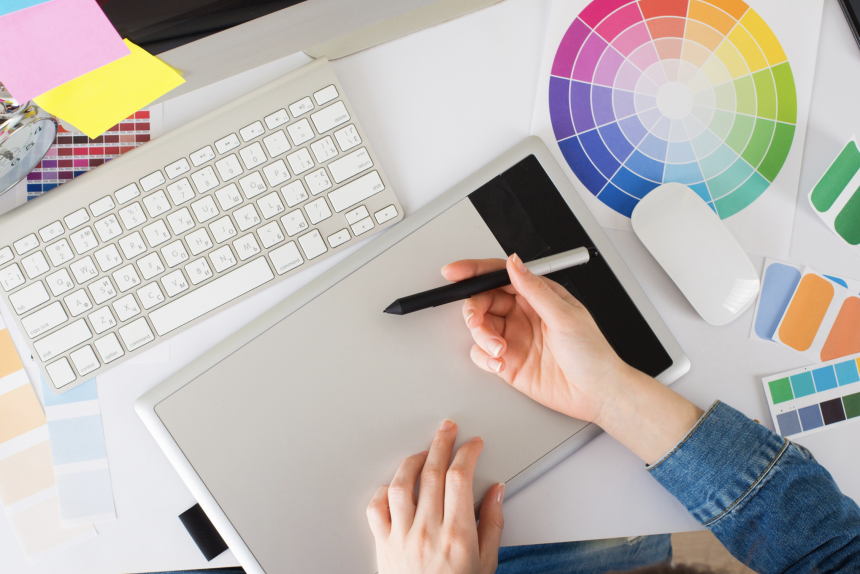
Do you need help with creative brainstorming? Everyone needs some graphic design tips that are more appealing.
It is a complicated process, and you need to figure out how to make your ideas come to life in a good way. Be sure to keep these designer tips in mind for an advantage against your competition. Let’s get started!
Harness the Power of Color
By combining many colors and shades, you create an array of visual effects that can be used to communicate an idea or emotion. To make the most impact, take a moment to consider the client’s brand palette for the colors you choose.
It will properly reflect the message and evoke the desired emotions. While high contrast can be used to draw attention, subtle color changes and skilled blending techniques will help to visually create texture and depth to make a design for beginners stand out.
Finally, it’s always beneficial to test design variations to make sure that the hues you have chosen are both aesthetically pleasing and proper for the audience the design needs to appeal to.
Utilize Negative Space Wisely
Start with a plan to divide your space with sections, then use negative space to focus the attention on certain areas. Next, create contrast between shapes and colors and emphasize the elements you want the viewers to see.
Finally, use empty space to create depth, cohesion, and dimension. Pay attention to the size and color of the negative space to make sure it maintains a balanced and visually appealing look. It’s easy to use negative space to create striking and creative graphic design tips.
Size Visual Interactivity Opportunities
Good design is all about creating the greatest impact, and size can have a big role in that. Start with a sleek sizing of visuals, text, icons, and logos to create a clean, visually pleasing design. Use size to find different sections, like headers and subheadings, to create order and hierarchy.
Start with what makes sense aesthetically, and figure out a way to make it fit with size restrictions via resize and crops. Have fun playing with sizes to bring visuals to life and create lasting impressions.
Pay Attention to Layout and Balance
Start with a grid system to give you an idea of the proportion and structure of a design before diving into specific details. Say, for example, you are about to create a certificate; make sure the elements of your design are aligned correctly. Poorly aligned elements make designs look messy and hard to read.
Negative space can help emphasize the elements you do want people to focus on. Grouping elements together, such as shapes and words, can help support balance and lead design viewers’ eyes to the most important parts.
Read More About the Best Graphic Design Tips
To conclude, the best graphic design tips and tricks can help any designer to create amazing visuals. With a little practice and knowledge, anyone can take their graphic design to the next level.
Don’t forget to check out the best graphic design tips and tricks for more insight into this fascinating practice.
Visit our blog for more, aside from this graphic designer guide.
Lynn Martelli is an editor at Readability. She received her MFA in Creative Writing from Antioch University and has worked as an editor for over 10 years. Lynn has edited a wide variety of books, including fiction, non-fiction, memoirs, and more. In her free time, Lynn enjoys reading, writing, and spending time with her family and friends.


