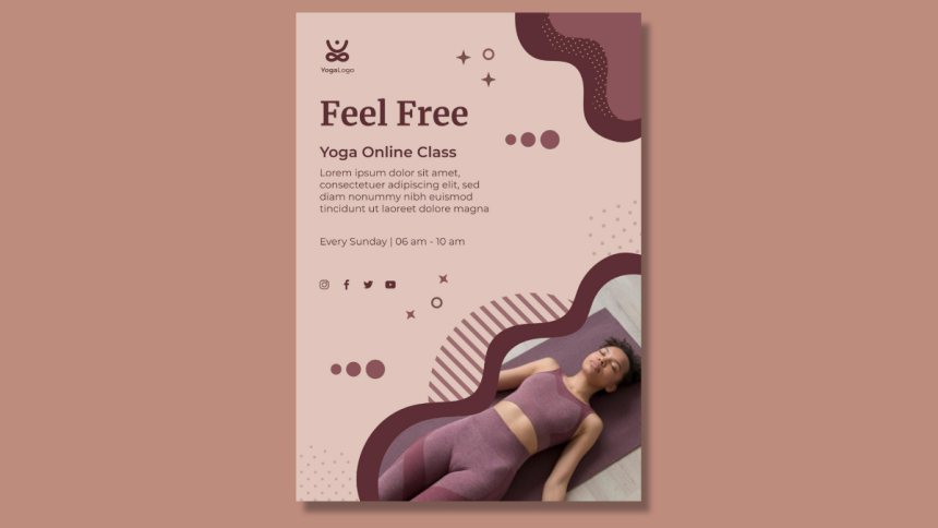
Feeling overwhelmed about promoting your yoga class? Creating an eye-catching flyer can be a difficult task, especially when you want it to stand out among countless other advertisements. You worry about not attracting enough students or not conveying the peaceful essence of your classes.
Don’t worry anymore! This blog is here to show you how to design an attractive yoga flyer that grabs attention and fills your classes. Let’s dive in and create a beautiful, effective flyer.
1. Start with a template
Using a template saves you time and ensures a professional look. Choose one that reflects the serene and welcoming atmosphere of your yoga classes. Adjust the template to match your branding by adding your logo, changing the colors, and tweaking the layout to suit your needs. This approach lets you avoid starting from scratch while still achieving a customized and polished design.
PosterMyWall marketing and design tool offers a variety of customizable yoga flyer templates. By using these pre-designed options, you maintain a cohesive and appealing flyer without the stress of creating one from the ground up.
2. Use eye-catching colors
Colors play a crucial role in attracting attention. Use calming colors like blues and greens to evoke feelings of tranquility and balance. These colors reflect the peaceful nature of yoga and make your flyer appealing. To highlight key information, incorporate pops of brighter colors, such as yellows or pinks. These vibrant hues catch the eye and ensure important details stand out.
Ensure your color scheme matches the overall vibe of your yoga practice. A balanced combination of soothing and vibrant colors will make your flyer visually appealing and easy to read. This harmony draws eyes to your flyer and effectively communicates your message.
3. Play with typography
Typography makes your flyer dynamic and engaging. Use bold, readable fonts for the headline to grab attention. Pair them with softer, more elegant fonts for the body text to maintain a harmonious look. Avoid cluttering the flyer with too many font styles; stick to two or three that complement each other, so that your flyer remains easy to read.
Bold headlines draw the viewer in, while elegant body text conveys your message with clarity. Consistent typography enhances readability and keeps the design cohesive. Limit font styles to create a clean, professional look that captures interest without overwhelming the reader. This balance makes your flyer stand out and effectively communicates your message.
4. Keep it simple
Less is more when it comes to flyer design. Avoid overcrowding your flyer with too much text or too many images. Focus on delivering your message clearly and concisely. Use bullet points or short sentences to convey essential details like class schedules, location, and contact information. A clean, uncluttered design makes it easier for potential students to quickly grasp the important information.
Too much clutter distracts and confuses potential students, making them less likely to engage with your flyer. Stick to the essentials and use white space strategically to give your content room to breathe.
5. Highlight unique offerings
What sets your yoga class apart from others? Highlight your unique offerings prominently on the flyer. Offer a free first class to attract newcomers or promote a serene outdoor setting to appeal to nature lovers.
If you specialize in a specific type of yoga, such as prenatal or restorative, make sure this is clearly stated. These unique features make your class more appealing and help potential students see the value in choosing you over other options.
Include images of your peaceful outdoor space or symbols that represent the type of yoga you teach. This approach helps your flyer stand out and makes it easier for potential students to understand why they should join your class.
6. Provide essential details
Ensure all essential details are clearly listed on your flyer. Include the class schedule, location, pricing, and contact information. This information helps potential students understand what you offer and how they can join. Make it easy to find and read by using larger fonts or bold text for these key details. Highlighting this information prevents any confusion and makes your flyer more effective.
A clear call to action, such as “Sign up now” or “Join us for a free session,” encourages immediate responses. Place it prominently on your flyer to grab attention and motivate potential students to take the next step.
Wrapping it up
Follow the above 6 steps to ensure your flyer looks appealing but also draws in new students. Start with a template, incorporate eye-catching colors, experiment with typography, keep the design simple, highlight what makes your class unique, and provide all the essential details.
These strategies will help you create a flyer that stands out and effectively promotes your yoga classes. Take these steps to heart, and watch your yoga community grow!
Lynn Martelli is an editor at Readability. She received her MFA in Creative Writing from Antioch University and has worked as an editor for over 10 years. Lynn has edited a wide variety of books, including fiction, non-fiction, memoirs, and more. In her free time, Lynn enjoys reading, writing, and spending time with her family and friends.


