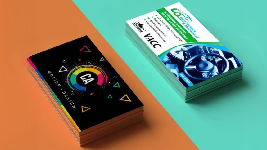
When it comes to business card printing and designing, it’s important to strike the right balance between creativity and professionalism. Your business card is often the first impression you make on potential clients or partners, so getting the design just right is crucial. From choosing the right layout to ensuring high-quality printing, every detail plays a role in how your card—and by extension, your brand—is perceived. In this guide, we’ll explore the key do’s and don’ts of business card design, helping you create a card that stands out for all the right reasons.
The Do’s of Business Card Design
Keep it Simple and Professional
When designing your business card, simplicity is key. A clean, uncluttered layout not only looks professional but also makes the card easier to read. Avoid cramming too much information or visual elements that could overwhelm the recipient. Instead, focus on highlighting the essential details like your name, title, and contact information. Using white space strategically helps emphasize these key points and ensures the card doesn’t feel too busy.
Prioritize Readability
One of the most important aspects of a good business card design is readability. This starts with choosing fonts that are easy to read. Opt for simple, legible fonts—nothing overly ornate or decorative that might obscure the information. Font size is equally crucial. Your name and primary details should be large enough to stand out, even when viewed from a distance. Also, pay attention to color contrast. Light text on a dark background, or vice versa, ensures readability, while poor contrast can make your card hard to read.
Include Essential Information
Your business card should serve as a quick reference for your contact information. Be sure to include the basics: your name, title, company name, phone number, email address, website, and any relevant social media handles. If applicable, add a logo or company tagline. However, don’t overload the card with too much info—too many details can dilute the card’s effectiveness. Focus on what matters most for your professional image and contactability.
Use High-Quality Materials and Printing
The material and finish of your business card can speak volumes about your brand. Opt for thick, durable cardstock to ensure the card feels substantial in hand. High-quality paper conveys professionalism, while thinner, flimsy options can give off the wrong impression. Consider finishes like matte, gloss, or embossed textures, which can elevate the tactile experience of your card and make it more memorable. Matte finishes offer a sophisticated, non-reflective look, while gloss adds shine and vibrancy. Embossed designs give your card a premium feel, making your logo or name literally stand out.
Stay on Brand
Consistency in branding is critical for business card design. Your card should reflect your company’s overall branding, using the same colors, fonts, and logos as your website, brochures, and other marketing materials. A cohesive design reinforces your brand identity and makes it easier for people to associate the card with your company. Staying on brand ensures that your card communicates a clear and professional message.
The Don’ts of Business Card Design
Don’t Overcrowd the Card
Overcrowding your business card with excessive information or graphics can confuse the reader and detract from its primary function: to convey contact information. Resist the temptation to squeeze every detail about your business or services onto the card. A cluttered design can distract from important information and may even lead the recipient to discard it.
Don’t Use Too Many Fonts or Colors
While you might be tempted to use a variety of fonts and colors to make your card stand out, doing so can lead to a disjointed or unprofessional look. Stick to one or two fonts and a limited color palette. This helps maintain a cohesive, streamlined design that’s easy on the eyes. Too many fonts or colors can confuse the design and make your card appear less polished.
Don’t Choose Low-Quality Printing
Printing quality can make or break your business card. Using low-resolution images or cheap printing methods can result in a card that looks blurry, faded, or unprofessional. Always invest in high-quality printing services that can produce sharp, clear text and graphics. DIY printing may be cost-effective, but it often falls short in quality, leading to a negative impression.
Don’t Ignore the Back of the Card
The back of your business card is prime real estate that shouldn’t go to waste. Leaving it blank is a missed opportunity to provide additional information. You could use the space for a QR code linking to your website or social media, a brief tagline summarizing your services, or even an additional design element that reinforces your brand. Just make sure it adds value and doesn’t clutter the overall design.
Don’t Forget to Proofread
Spelling mistakes or outdated information on a business card can instantly harm your credibility. Double-check every detail—your name, title, phone number, email address, and even social media handles—before sending the card to print. Proofreading is an easy yet crucial step that ensures your card maintains its professional appearance and accuracy.
Crafting the Perfect Business Card
A well-designed business card can make a lasting impression and reflect your professionalism. By keeping the design simple, prioritizing readability, and using high-quality materials, you ensure that your card not only looks great but also communicates essential information effectively. Avoid common pitfalls like overcrowding, overuse of fonts and colors, and poor-quality printing, which can detract from your brand. Taking the time to proofread and use the back of the card wisely can further enhance its impact. With these do’s and don’ts in mind, you’ll create a business card that helps you stand out and leaves a positive impression.
Lynn Martelli is an editor at Readability. She received her MFA in Creative Writing from Antioch University and has worked as an editor for over 10 years. Lynn has edited a wide variety of books, including fiction, non-fiction, memoirs, and more. In her free time, Lynn enjoys reading, writing, and spending time with her family and friends.


